Patreon Project: An Art Book of Fully-Dressed Fictional Femmes

Hi gang,

For a while I’ve wanted to do a Patreon, but had no idea what to pitch to you. I don’t run a webcomic, I do book reviews on YouTube maybe once a week, and my books don’t come out often enough to reward people for subscribing.

However, I think I’ve figured it out. After some conversations with my friends, I’m going to start doing regular artwork, with the intention of assembling a book to publish later on. It’s too early to say when or how on the book, but I want to start drawing the content pretty soon.

The theme is simple: well-developed female characters, in practical roles and with practical accessories.

This came to me when one of my friends mentioned that her teenage daughter had a hard time finding fantasy art or superhero art with female characters that weren’t flagrantly sexualized. I agree that this is a problem, but it’s one of those social powder kegs these days, the kind you can’t talk about without one side screaming “CHAUVINIST!” and the other screaming “FEMINIST!” and the whole thing goes up in smoke.

Well, I decided I don’t care about any of that. The simplest way for me to do anything about it is to just draw cool characters doing cool things in a respectable way. There isn’t enough of it out there, so I’m going to contribute.

Who will I draw? In order to avoid copyright infringement, I’m going to use my own characters, both from my published and unpublished works. That means the entire lineup of femmes fatales from the Engines of Liberty series, Danielle from KILL THE BEAST (pictured above), and the Amazons from THE HERO NEXT DOOR.

But wait, there’s more! I don’t think you guys realize the number of projects that I have brainstormed or world-built, but haven’t yet outlined. I have a ton of characters on deck. From mechanics to jockeys, steampunk machine operators, hellhounds, magicians, military leaders, farmers, rebels, gunslingers, warriors, alien invaders, small-town ghost hunters, fantasy folks of all colors and sizes, superheroines, starfighter pilots, and mech captains…and that’s just so far.

By my current count, I have a list of 52 of them to do, and some of them merit more than one drawing. Even if I did one per week (which I probably won’t…life just happens) it would take me all year to finish it.

THUS, here is my pitch: I’m going to start these drawings, and though I will post progress shots along the way, I will only list the final versions on the Patreon for the backers to access. That way you can get them as they become available, and don’t have to wait until 2019 for the publication.

The monthly subscriptions will be very cheap, too. I might have three levels of support, with the highest one coming in at $5 a month.

Whatever money I’m able to raise for it will go toward supplies and materials, and will help me render high-quality digital versions of these characters for the eventual book. I will figure out other perks along the way, based on what I can manage.

I’m excited to undertake this, and to put these characters out there. Hopefully you’ll want to be a part of it!

Feel free to weigh in via the comments box, or drop me an email: dreadpennies [at] gmail.

Thanks everyone!

“Bright,” a Netflix urban fantasy movie.


I’ve been excited for this to come out since it was announced earlier this year. With superhero movies entering their tenth year of solid box-office dominance (I’m marking Iron Man and The Dark Knight as the start of the era), people are already starting to burn out on the genre, despite each new Marvel flick being worth the hype. (DC has had fewer hits than misses.)

Nevertheless, as a longtime fan of the urban fantasy literary genre, I’m excited to see something make it to…well, not the Big Screen, but a high-budget production, with two strong leads in Will Smith and Joel Edgerton. And I didn’t realize Noomi Rapace was in it too.

I’m going to watch it tonight, and randomly thought I might stream-of-consciousness review it, to anyone who’s curious. Here we go!

Oh, and OBVIOUS SPOILER WARNING.

–Opening credits were ace. It’s filmed as though from the passenger seat of a car, driving through graffiti’d parts of Los Angeles, and the graffiti itself is on par with the high quality street murals I saw all over Spain. In a fantasy movie, you’d normally get a long prologue about prophecies and whatever. Not here. They used drive-bys of street art from the POV of a beat cop to perfectly set the tone.

–Okay, we have humans somewhere in the middle, elves are the higher class, and orcs are basically ghetto trash. Looks like there are fairies in this world too, but they’re regarded as pests.

–5 minutes in, half a dozen F-bombs. Eesh. There are other words, you guys.

–Good glimpse into Daryl Ward (Will Smith)’s home life. Nick Jakoby (his orc partner) is immediately likable. Easy banter between the two of them, over everyday stuff like the lawn. One of the quickest ways to make fantasy elements normal in an urban fantasy is to treat them like they’re urban, not fantasy.

–Ha. Orcs like heavy metal. Does that trope predate the orcs in Larry Correia’s books?

–I love Nick’s social awkwardness. I get the impression it’s a cultural thing, among orcs. He just goes there.

–Daryl makes himself very unlikable with how he treats Nick. I’m getting the sense that that is supposed to be part of the story–a cop with a minority partner who he doesn’t like, and blames for his injury…coming to rely on him.

–Elftown. Very garish. Like Beverly Hills and Hollywood had a lovechild that kicked out the riffraff.

–Centaur cop! Nice!

–Still heavy on the F-bombs. Calm down peeps.

–Hood orcs. Nice. Superstrength is one thing, but you can’t lift a truck by the grill like that. The latch that holds it down wouldn’t support 2/3rds of the vehicle’s weight. Should have had him grab it by the bumper.

–The tension is real with Ward and Jakoby. Going back to the “urban vs fantasy” thing, they’re playing this real. If they were both humans, and Ward was a pretty committed racist, and Jakoby was a minority on the police force, their demeanor would be exactly the same. That said, it’s hard to watch. Usually when Will Smith is on screen, you like him. Right now, in Act 1, you don’t.

–Nasty homeless man prophecy. Okay, foreshadowing…

–“Half the defensive lines in the NFL are orkish.” That’s a story prompt right there, son.

–The more we see of this LAPD, the more we’re to take it as a gritty, grungy, everyone-is-a-jaded-scumbag organization. Hard to find heroes in that setting.

–Nice little expository interrogation scene. Interesting stuff though.

–Nick can smell blood in a hood house, but not a body that was burnt to a crisp?

–Whatever that crazy magical chick was, though…nice effect!

–The cops show up, boom, more everyone-is-a-scumbag syndrome. I like seeing Ward changing in response to a new factor, e.g., the magic wand. This dude does have one or two points on his moral compass that differ from everyone else’s.

–Of all the jerk cops in this department, I hate that dude with the mustache the most, and that includes Sergeant Margaret Cho. I bet he dies first.

–Okay, this face-off between Ward and Jakoby, in the wake of the dilemma with the other cops…this is good. Gooooood drama. Still too many F-bombs though, and that’s coming from a blue collar construction guy.

–HOOOOOOOOOLLLY CRAP!!! When Ward turns!!! HOOOOOOOOOOLY CRAP!!!!

–The Altamira cholo boss in the wheelchair is a…bit of a stretch, but his powerslide in the street was funny.

–Nice gunfight car chase. Excellent crash scene.

–Evil Mustache Cop doesn’t die first. But he does die.

–Oof…brutal throat-cutting. Ick.

–Oh come on, you can’t just randomly show us a DRAGON flying over LA in an establishing shot and then do nothing with it! I want moar dragon! MOAR DRAGON!

–Yuck. The baby…that was not cool.

–MAN ALIVE these cholos have terrible aim. How many rounds does that shotgun have? I think Ward has outfired his Protagonist Magazine at this point.

–Grungy orkish butcher shop naturally has an open door into a grungy orkish night club.

–Aaaaaaand obligatory boobs. Come on, people.

–Oh noes, how did we lose the only white-skinned-white-clothed-white-haired chick in a black-clad moshpit?

–Lol. Rival gang breaks in with machine guns and it is indistinguishable from club music in Orctown.

–Other than that…surprisingly anticlimactic.

–The human anti-magic Fed looks like a ginger John Goodman.

–Strip club scene. Ugh.

–Sweet jeepers, these are not Tolkien’s elves.

–Good arc for Ward, when he and Jakoby figure things out between themselves. Knew it had to happen but it’s really nice that it finally did.

–Ninja elf fight!

–Man, Ward’s Protagonist Armor is LEGIT

–Hmmm. A bit of a stretch, but for the purposes of the story, I will accept this gas station explosion.

–I have to think that if orcs are strong enough to lift up a truck, then any effort put into a gang beating would probably pulverize someone after a punch or two. Not even Ward’s Protagonist Armor can take that, and these orcs are grunting.

–Jakoby’s good deed comes home. Not a unique plot device, but it works.

–Whoa, until it didn’t.

–Okay…how did she have that up her sleeve? Hidden? And why wait until AFTER Jakoby snuffs it?

–Ah, that’s why. Orc Jesus, ladies and gentlemen.

–Heavy, heavy, instantaneous foreshadowing with the homemade bomb. That was pretty forced for a gimmick.

–Jakoby with the Protagonist Armor! Only this comes in the form of Villains Not Killing Him As Fast.

–I don’t know what the heck that fridge is made out of, but they should make airplanes out of it.

–Tikka’s blood goatee: not the hottest thing in the world.

–Of course they could only have ever killed Leilah The Evil Version of Legolas right next to the Ghetto Refrigerator Of Peripheral Resurrection. Not your fault, guys. Could happen to anybody.

–NOW KITH

–Man, they really nailed the zealotry gaze on these elves.

–Oooh, they got her monologuing!

–You saw it coming! MAGIC BLACK MAAAAAAAAAAN!!! #TROPE #TROPE #TROPE #TROPE

–Great hero moment there at the end.

–Yup. Will Smith is still Will Smith.

–Nick’s a hoot. Perfectly played the debriefing scene right there at the end. “Oh, I see what this is.”

–Roll credits.


Okay well, overall I’d give it a high B rating. I do hope it opens the gate for more urban fantasy. I just hope they don’t feel the need to be so excessive with the graphic content. No, I don’t care if a lot of successful urban fantasy has that in print, don’t @ me. It’s not a help to the story or the medium, even if there’s some stuff, there doesn’t need to be as much. Blah. </rant.>

Well, I’ve gone and done it now.

If you’ve followed the saga on Facebook, I’ve spent the last couple of weeks poking fun at cheesy Christmas romance movies, especially in the wake of Netflix taking potshots at its users on Twitter.

Well, as these things often go, one thing led to another, and I threw down a gauntlet on social media: if a particular post got 30 reactions (which isn’t a high number to you kids and/or successful personalities out there…normally I only break 30 when my wife gives birth) I would agree to write a romance novel (cheesy or otherwise) under a female pen name, and publish it.

With a few hours left to go, it didn’t look like it was going to happen. Then a few of my friends (Jared, Dennis, TJ) shared the post and the pace picked up dramatically. The threshold was reached, shattered, and mocked to ashes.

And so, here we are.

I could take the easy way out and say, “The point is to write a romance novel under a pen name in such a way that you’ll never know it was me.” Thus, I could lie to you, and say at any point that I wrote the novel, published it, made money off of it, and will never tell you The Pen Name.

But I won’t do that. Because that’s a turd thing to do.

THUS. I am establishing some ground rules for this effort, and you’ll just have to take them at face value, until such time as someone–anyone–reads the book and figures out that I wrote it.

Here we go.

RULE THE FIRST: I will write and submit a draft of the book to a publisher this year. I have a few in mind. They will probably be small presses.

RULE THE SECOND: Once the book is published, I will add it to my Goodreads list of books I have read. Note that I will read a lot more romance this coming year, both to prepare myself for writing this, as well as to throw you off the scent. I will keep doing this until the book is published. (Which might not be 2018, to be fair.)

RULE THE THIRD: I will tell only my wife and any potential editors the pen name I come up with. It will not be derived from any family names in my tree (that I know of), nor will it be any female character names I have used in published novels.

Note that I will not post any updates about this in real-time. I will, however, make a Facebook page, a Goodreads profile, a blog, and an email address under the false persona. The hard part will be finding someone willing to sacrifice their face to this endeavor, should it become necessary.

Nevertheless, I will persisted.

(DO YOU SEE WHAT I DID THERE)

Annotated Artwork for “Engines of Liberty: SUICIDE RUN.”

This is part two of a series. The rundown of the REBEL HEART illustrations can be found here. Should help you get an idea of how much I improved between books 1 and 2.


sh1

This is when I started inking (I did it to the RH artwork long after the fact.) It helped everything stand out in a starker contrast, which was good, but the weakspots were still obvious. Kalfu’s dreadlocks, for example. I don’t think outlining each one was the right move. The lighting on the folds of his cloak wasn’t perfect, and neither were his boots (a weakness of mine.)

sh2

Another piece where I didn’t immediately grasp the right use of the ink, namely with the smoke and dust surrounding Kalfu. Godfrey’s robes are too straight and lack detail as well.


sh3

Boots, mostly. Also I focused too much on the individual folds and wrinkles in Calvin’s coat, instead of shading it on a large scale.

sh4

Perspective was tricky here. There eyes aren’t all aimed right. I still think I made the right call with the folks in the background, though. I didn’t want their details to overwhelm the foreground.

sh5

Pretty pleased with this one, just shading and stuff.

sh6

Changing the reference model for Amelia made drawing her a lot easier. Still, I should have shaded the front of her shirt a little more, but I was still using graphite to shade this stuff.

sh7

I think the shape of the boots could have better complimented her legs from the knees down. Skirt shading was relegated to the edges, instead of working into the folds.

sh8

I picked the right places to shade on the gryphon mimic, but not the right range of value. The wings are too dark and the neck and landing gear are too light. They would all be the same color, for camo. Also, graphite was less effective for rendering the complexions of the black characters, in this picture, Adam and Hank. (I switched to charcoal for book 3.)

sh9

Could have taken more time on the shading and the folds of their coats. With the shading I didn’t focus enough on the angle of the light.

sh10

Too dark in the back and bright up front. I might have re-done this one, too.

sh11

Boot laces are my only complaint.

sh12

Shading, light angles, the usual.

sh13

Shading on his robes, especially near the hem.

sh14ash14b

I re-did this one, the original version was really, really terrible. I’m immensely pleased with this.

sh15ash15b

Light angle, shading, and I would detail the rocks and ground more, instead of using broad strokes to fill them in. Not enough going on in the sky, either.

sh16

Body proportions are off. Upper chest too broad, arms too small.

sh17

Shading for the base of the chair, and Hamilton’s clothes. I would probably detail Hamilton’s face better, too.

sh18

I wouldn’t render all of the text digitally, just some of it. It was important that a lot of it look handwritten, but some of it could have been done in a program.

sh19

Shading on the boots, put a shadow under him. And I would re do his face. It doesn’t look like Hank.

sh20

Shading on their coveralls.

sh21

Shading, and the angle of Avery’s face (right.)

sh22

Shading, boots too big, and Lyla’s poise seems awkward next to Edsel’s.

sh23

Face too dark, among other usual stuff.

sh24

This was when I started to realize I needed models for poses.

sh25

I would crisp up the details on the tail feathers.

sh26

Detail the trees better in the background, they detract from the details I like in the foreground.

sh27

The shading is way off, the position of his legs is super weird, and he doesn’t look like J. Scott Savage, as he should.

sh28

Again, posing, this time for the arms. I needed a model. Also his mouth is weird.

sh29

Pretty pleased with Edith.

sh30

Right hand position, too much face shade.

sh31

I wouldn’t have used the ink for the tattoos, it makes them too stark, they should blend better with the color of Thierry’s flesh.

sh32

Sufficient for the purpose it served.

sh33

Yeah, I would re-do this entirely.

sh34

Pleased.

sh35

Not enough detail on the ground, and I shaded the three recruiters as if they were closer to the screen, i.e., I should have used broader strokes to give the “suggestion” that they were there.

sh36

Leg armor, robes from the waist down, and the scales on the reptiles. All need improvement.

sh37

Same as before with Kalfu: gotta figure out how to detail smoke and dust better.

sh38

I would have changed the angle of Yahola’s prosthetic.

sh39

Blah. Godfrey looks like a bad Super Mario cartoon. I could have done a much better pose with a model (which I now have, forgot to mention that.)

sh40

Hard to draw this in the dark. Too much to list, but it mostly boils down to light values, textures, and angles.

sh41

Proud of this one.

sh42

The post of her boots coupled with the messiness of her hair makes her look a little too “come hither” and that’s not in keeping with her character. So I’d change that, mostly.

sh43

Not how this one looked in my head, but I wasn’t drawing it big enough. I would re-do it now.

sh45

Calvin’s face looks weird but he did just get in a huge fight. I’d focus more on correcting his arm angle.

sh46

Mostly Godfrey’s face, and the map behind him. I’d probably put more debris on the floor and so forth.


So that’s it. I got better at some things but was still weak in others. Next week I’ll post the PATRIOT’S GAME art and you’ll see a lot of things that got better once I changed materials.

Annotated Artwork for “Engines of Liberty: REBEL HEART”

For a while now it’s been necessary for me to put my illustrations online so it’s easier for me to share drawings from past books. Recently I had a chance to share all of my published art with some old friends from Spain and they commented on how much it had changed in just a few short years.

Many artists and writers–especially younger ones than I–can benefit from things I learned throughout the illustration process for the Engines of Liberty novels. I’m sharing this in the hopes that they’ll get farther ahead than I did, and in less time.

For reference, I was illustrating this book from January of 2014 through March of 2014, generally after work, or if I had time off. For this first book I used mechanical pencils with .07 and .05 lead, then shaded with a standard no.2. This was not a great way of doing it, and that’s something that became very obvious when it came time to digitize the art. I eventually switched to ink and charcoal, which will be more noticeable once the art for PATRIOT’S GAME rolls around.

Until then, here is the entire slate of art for REBEL HEART, with some notes after each piece. Please note that they are not displayed here in the order in which they appeared in the book. Enjoy!

rh40

The eponymous “mimic brigade” needed a flag, and since the crossed stars and bars of the Battle Flag of Northern Virginia (ahem) was readily recognizable, I repurposed elements of it for the brigade flag. Things being what they are these days, I would likely not go this route again. The origins of the design are never discussed in the story, as it never becomes relevant. The Rebel Hearts themselves are a pretty diverse group, comprising brigade leader Hank Duncan, a black American; brigade mechanic Adam Paige, also a black American; tail gunner Ingvar Prebensen, a Dane; pilot Emma Crosby, an Anglo girl from the Carolinas; and of course, Calvin Adler, of Anglo-German descent.


rh39

She’s the officer in command at Camp Liberty in Ohio. I wanted her physicality to come in direct contrast with her personal demeanor. She’s stone cold and rock hard, and while these qualities can be virtues in a military leader, they have their own built-in flaws.


rh38

One of my favorite elements of this world is the machines that the rebels build to “mimic” magical creatures. A unique challenge of this one was the fact that it takes place at night, there are headlights cutting through the dark, and the engines from the machines kick up a lot of dust. Were I to draw it again, I spend more time on the lighting and the dust. Those were the hardest parts.

rh37

You’re really not supposed to like Captain Hamilton, so making him ugly was an obvious move.


rh36

Surprisingly enough, some Brits have read these books and given me feedback! As much as I avoid profanity in English, apparently I don’t do such a good job of it in…other English. 🙂 If I changed anything on this drawing, I would work on getting the angles of Godfrey’s face right.


rh35

Godfrey was as fun to write as Calvin was (villain and hero, respectively.) I used my brother-in-law Joseph as a model for Godfrey. I don’t think I got the light angles right for the shading.

rh34

Biggest issue on this one: Winston Fitznottingham (the mage) has an awkward stance, and his robes flutter in an unconvincing manner. I got better at this later on.

rh33

I’m still pretty proud of this one. I’d spend more time on the grass and leaves on the forest floor, annoying as they were. I’d also use models for the mages as they get blown off their brooms by the grenade blast; they look unrealistic in their poses.


rh31arh31b

I’d shade the wings on the dragonling mimic a little better, detail the grass island in front of Mount Vernon, try to sharpen up the details on the tree leaves, and re-shadow the mountains (and the reflection) with ink instead of so many pencil strokes.


rh30b

Calvin’s proportions are a little off, even for an awkward teenager. One problem I struggled with consistently was drawing the boots too big.


rh30

The angles on Edsel’s face and hands look weird to me.


rh29

I’d pay closer attention to the lighting direction on the peripheral machinery. Other than that I was really proud of how I came up with this, and how it ended up.


rh28

Another one where boot size wasn’t done right. Other than that, I’m pleased. My friend Zach, a lawyer, volunteered to be the model for Edsel.

rh27

Eh…I’m not thrilled with the shading. I could have made the inside darker, and the light direction clearer from the outside.


rh26

Okay, here’s a good one: I didn’t zoom in enough on the action (Calvin wrestling the panther, Edsel coming to the rescue.) As a result, the most exciting part of the drawing was too small, and I spent the rest of the time drawing fricking foliage.

rh24

Another instance of bad zoom control. The barn looks HUGE and empty, even though in this scene there are more than four people. Still the important part is that Calvin and Edsel are fighting.


rh23

In future, I would just add this text digitally instead of trying to draw the font by hand.


rh22

Given how this was a small piece, I don’t mind the pencil strokes for the ground, but Jack’s left hand looks puffy, and the “stench lines” from his curse look…low-energy?  Cartoonish? It brings down the rest of it.


rh20

This came together well, even the boots. I think Brian’s face looks a little too flat, too. Angles got tricky with fight scenes.

rh19

Another tricky face angle, this time for Calvin. I should have practiced a few light pencil lines on a separate sheet of paper.

rh18

Biggest issue here is character proportions, and shading/light direction. A recurring problem.


rh17

I started each chapter with a drawing of a character, but this one got three of them. I needed to control the sharpness and detail, as well as light values/direction. Normal stuff. The crispness wouldn’t change until I changed my materials.


rh16

Most of my time here went into the background, what was on the pantry shelves and all that. Also I think I was inconsistent with Calvin’s height here, but then I don’t really do another drawing of him next to Commodore McCracken. Calvin’s left arm seems a touch too long, and the typical light values are an issue.


rh15

Crispness and light value. Other than that, this came out well. Brian’s supposed to be a tough-guy type.


rh14

Needed to detail the grass more, or cover it up with more relevant stuff. Also, trying to draw muzzle flare in the dark plays haywire with the light values. This was an early attempt, and not my best one.

rh13

Originally, my friend Megan Hibbert was the model for Amelia, but she always had the same expression in every one of her pictures (a very bright smile.) I eventually swapped her out for a celebrity whose Google Images yielded a higher variety. Also, crispness and body proportions.


rh12

I retconned this later to make her a little taller. Crispness, etc.


rh11

I spent all of my time drawing Mount Vernon in the background, and not enough time on the people in the pigpen. Also needed more boars from more angles. Calvin’s eyes look weird too.


rh10

Boots and light values, normal stuff.


rh9

Now, obviously I play with the architecture at Mount Vernon, but there’s no way it’s large enough for all of the stuff in this story, and that includes this gigantic theater inside. That said, the reader will generally not be aware of this, and any number of behind-the-scenes explanations could give it credence. I’m pleased with it otherwise. I think I’d use better light values, and try to curve the projected image on the screen below. Also…the podium has no shadow on the screen.

rh8

This one worked as-is because it’s meant to be hyperbolic propaganda. King Charles is not actually an ogre in these stories.


rh7

Proportions and poses. I didn’t get their feet lined up right. This was the first drawing I tried like this, with them all lined up horizontally, and the only one I did like this.

rh6

Psh. This one’s perfect, fight me.

rh5

More propaganda-style art. I’d only do the text digitally, like with Jack Badgett’s saddle above.

rh4

Shading and light values. This was only the second or third piece I did overall, so I will cut myself slightly more slack.


rh3

Proportions, light angles, and I think I smashed Calvin’s mom’s face a little.

rh2

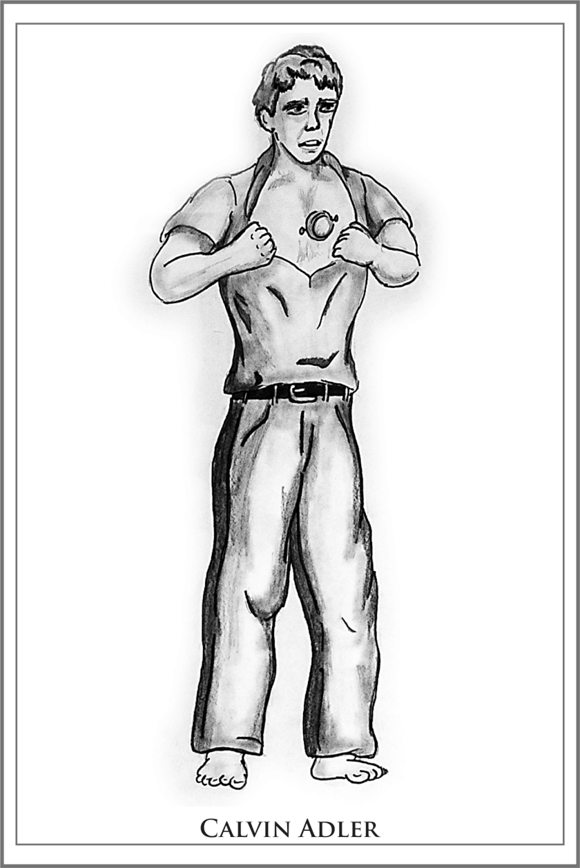
Calvin was modeled after my other brother-in-law, Patrick, who’s mildly autistic. I don’t think I did justice to Patrick’s/Calvin’s facial expression here. This piece was the very first one I did for REBEL HEART, or the Engines series at large. It took 3 days, and generally I’m still pleased with it. Outside of Calvin, the only thing that really bugs me is the roof tiles on the Tanners’ place. Grass, lighting, the ground, normal stuff after that.

rh1

A better version of Calvin, but again, disproportionate legs and feet and so forth.


rhr1

This was one of four drawings that had to be re-shot before I could include it in the book, as they’d been scanned poorly. Leg proportions and the shading on the clothes are off.


rhr2

Legs, shading.


rhr3

Just a little touch-up work on the shading, the rest of him is fine, I think.


rhr4

After illustrating this book, I specifically  bought a book on how to draw and shade folds in clothing, because this one was pretty glaring. Also, fun fact, I modeled these guys after James A. Owen and J. Scott Savage.


Whew. That was a lot. I’ll post the SUICIDE RUN art next week, and you can see how that improved over this book, and what still needed work even after all that art. Feel free to share your thoughts in the comments. Thanks, all.

My Best Books of 2017

Hi gang. You know the drill. Here we go:

Image result for scythe shusterman

SCYTHE by Neal Shusterman. Reviewed here on my YouTube channel.


Image result for dublin murder squad

Dublin Murder Squad 1-3, by Tana French. Comprising IN THE WOODS, THE LIKENESS, and FAITHFUL PLACE. There are 6 books so far, but 4 and 5 were letdowns. The first 3 were amazing. Reviewed here.

Image result for dragonwatch

DRAGONWATCH, by Brandon Mull. His premiere series, Fablehavenis a longtime personal favorite. DRAGONWATCH is the first in a sequel series that proves he’s still got it. Loved everything about this book.

Image result for bobiverse

Bobiverse 1-3, by Dennis E. Taylor. Comprises the volumes WE ARE LEGION, WE ARE BOB; FOR WE ARE MANY, and ALL THESE WORLDS. Rip-roaringly good sci-fi adventure. Reviewed here.

Image result for dragon teeth

DRAGON TEETH, by Michael Crichton. One of his earlier works, despite being posthumously published. It’s about an intriguing period in history called “The Bone Wars,” wherein two rival paleontologists tried to outdo each other in their field, sometimes by nefarious means. Review here.

Image result for sleeping giants

SLEEPING GIANTS, by Sylvain Neuvel. Hell of a book! Lamentably I found the sequel, WAKING GODS, to have a touch of a sophomore slump. Nevertheless, I’m eagerly looking forward to ONLY HUMAN, the third installment. Review here.

Image result for the end of night

THE END OF NIGHT, by Paul Bogard. I would never have read this book without my brother’s recommendation, but it’s very thought-provoking. It deals with how artificial lighting impacts human biology and our ecosystems around the world. Review here.

.

Image result for undaunted courage

UNDAUNTED COURAGE, by S.R. Ambrose. Speaking of the Indianapolis Colts, this was the July selection for the Andrew Luck Book Club. It’s a detailed history of the Lewis and Clark expedition, including their lives before and after their legendary trek.

Image result for weird west tales resnickImage result for weird west tales resnickImage result for weird west tales resnick

Weird West tales, by Mike Resnick. I read 2&3 this year. YouTube video here.


Image result for lady mechanika la dama de la muerte

Lady Mechanika: La Dama de la Muerte, by Benitez. My YouTube review covers the whole series, though it was this volume in particular that I loved.


HONORABLE MENTIONS

Image result for johnny u and me

JOHNNY U AND ME, by John C. Unitas Jr. This is a career and family bio about legendary NFL quarterback Johnny Unitas, written by his son, John Jr. Unitas played for the then-Baltimore Colts (now in Indianapolis) and is in the conversation for being among the greatest to ever play the game, and certainly the greatest of his era. However, I included this book for its value as a teaching tool: it talks about his life behind the scenes, and his imperfections. Some of those old-time qualities we admire come with an ugly price tag. We would do better to respect our sports heroes for their accomplishments, and learn from their flaws. Even the Man with the Golden Arm wasn’t perfect. I applaud his son for his hard work in putting this book together


Image result for artemis weir

ARTEMIS, by Andy Weir. Also did a YouTube review.


Image result for undaunted lund

UNDAUNTED, by Gerald Lund. This one sat on my shelf for eight years before I got around to it. It’s equal parts fiction and non-, as Lund did heavy research not just into the time period, but the people who actually trekked through the now-destroyed Hole In The Rock. I found the non-fiction elements more engaging than the overall storyline, so epic was it in scale and import.

Image result for on combat grossman

ON COMBAT, by Dave Grossman. A non-fiction about the physical and psychological toll on the human body in modern combat. Very enlightening.


Image result for snapshot sanderson

SNAPSHOT by Brandon Sanderson. Blogged it here.